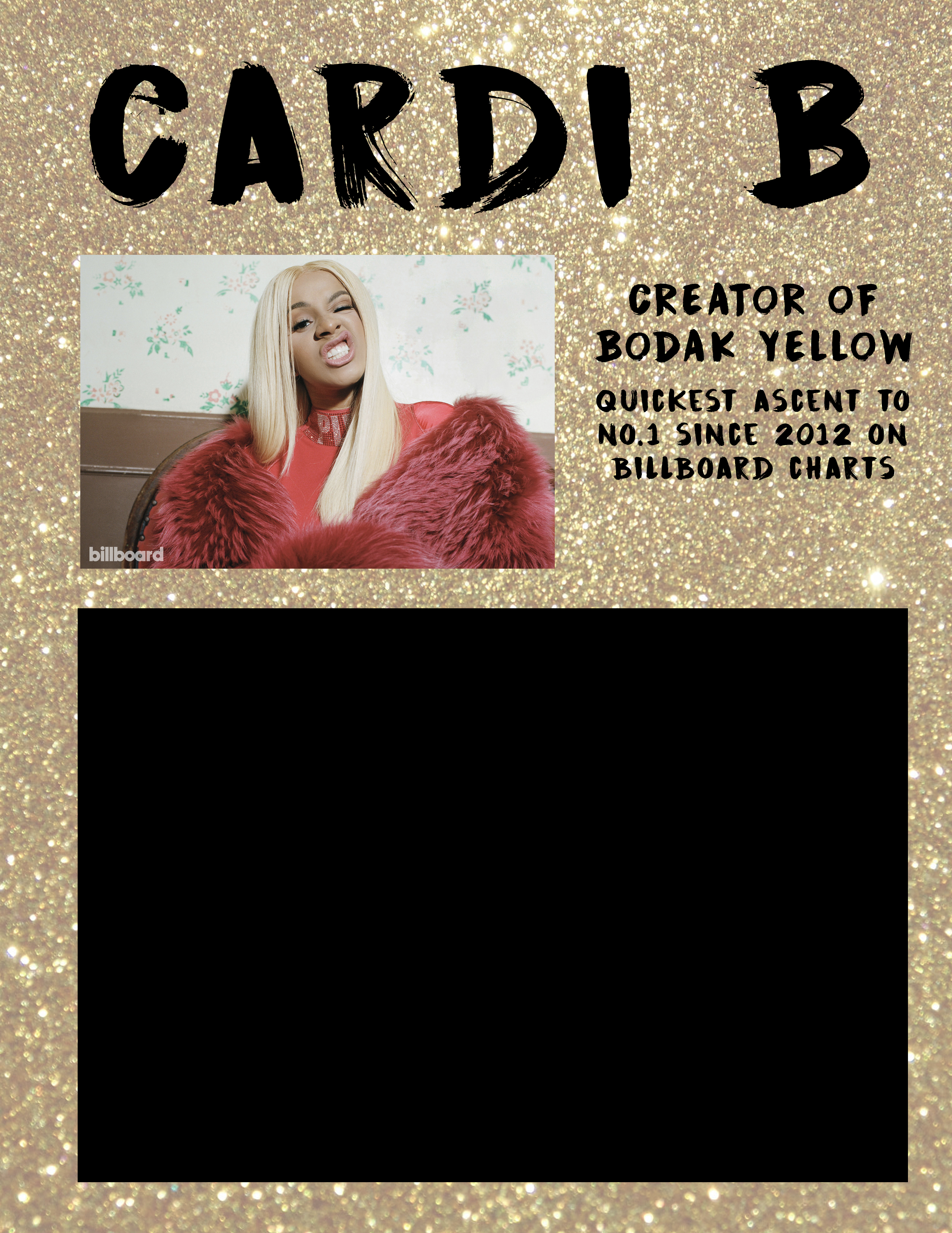
At first, I was completely lost at what to design. I wanted to use a gold background to convey Bodak Yellow and a sense of wealth.
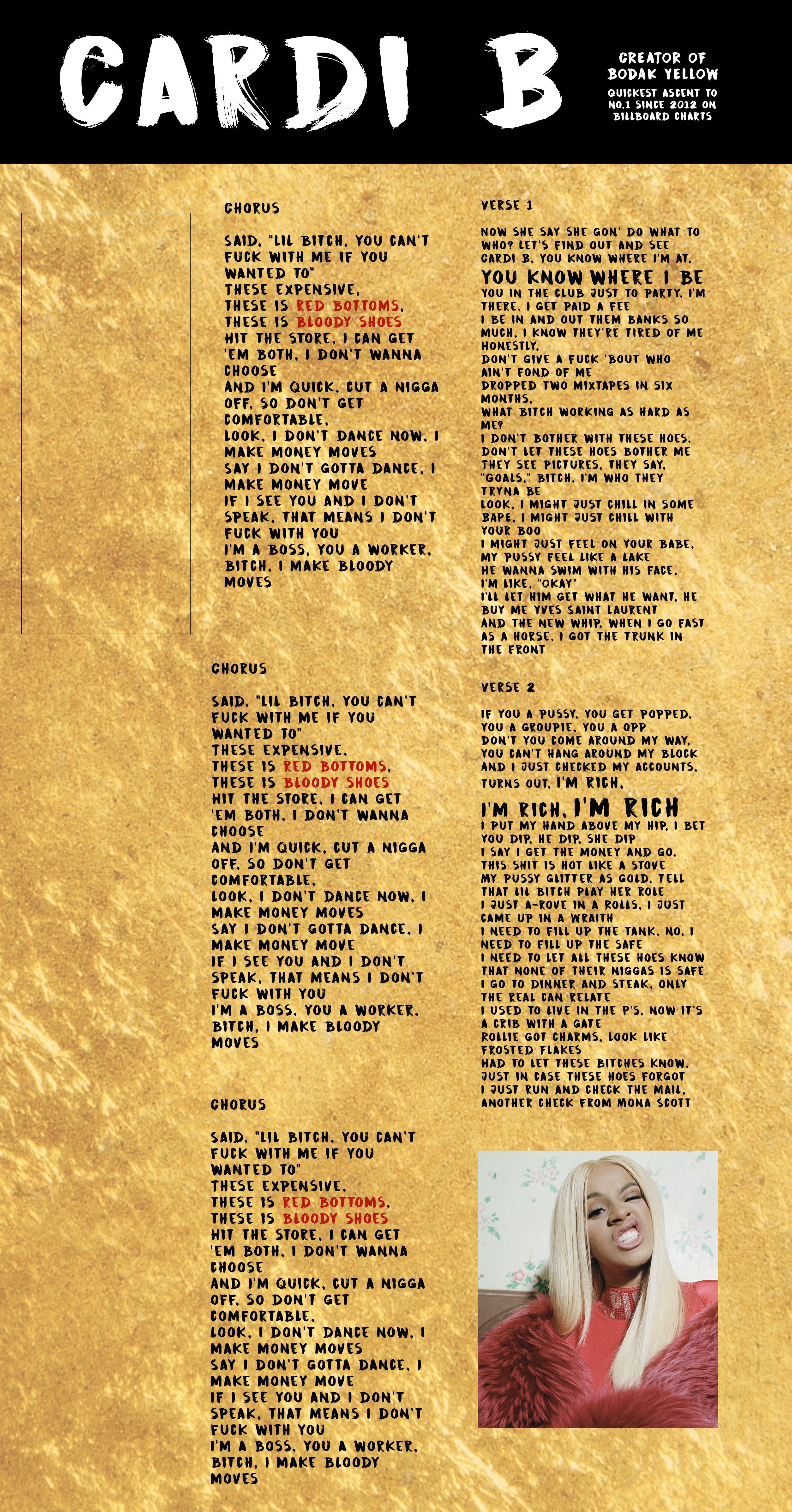
Then with Ashley, it was suggested that the new gold background did not really read as gold but rather a paint texture. Also that the type face choice was a bit hard to read.
With Nick, I had some of the type changed to a simple, sans serif. He suggested I brought the opacity of the gold background back up because he thought the text was actually not that hard to read.